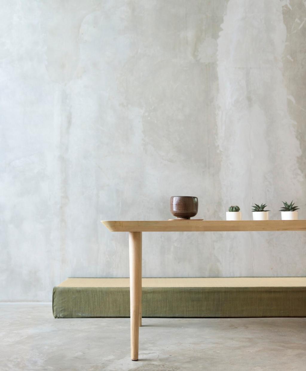
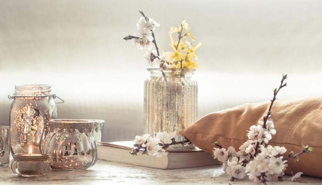
Chosen theme: Choosing a Color Palette for Minimalism. Welcome to a calm, considered approach to color—where fewer hues do more, light feels softer, and every shade has a purpose. Subscribe for weekly minimalist palette recipes and real-life room transformations.

Minimalist Color Foundations

What a Minimalist Palette Really Means

A minimalist palette limits the number of hues while expanding nuance through value, undertone, and texture. Think two to three core colors, plus controlled accents, so every surface works together rather than shouting for attention.

The Power of Negative Space and Quiet Contrast

Negative space is not emptiness; it is breathing room for color to resonate. Aim for soft contrast—gentle shifts in lightness and temperature—so edges feel intentional, not harsh. Share how you balance contrast without losing calm.

Finding Your Visual Anchor

Choose one anchor—often a warm off-white or muted greige—that sets the mood for walls, ceilings, or major furniture. This anchor becomes your reference point for all other choices, preventing drift and decision fatigue over time.

Color Psychology for a Calm Home

Look for neutrals with a soft heart—warm whites, bone, flax, and gentle greige. Their light reflectance values around the 72–82 range keep rooms bright without glare. They cradle daylight rather than reflecting it sharply across surfaces.

Light, Undertones, and How Rooms Really Behave

North light cools colors, making blues crisper and beiges grayer. South light warms, flattering creams and muted greens. Pair that with bulbs around 2700–3000K and a high CRI to preserve subtle undertones in minimalist palettes throughout the day.

Light, Undertones, and How Rooms Really Behave

Every “neutral” hides an undertone: pink, yellow, green, or violet. Test large swatches across morning, midday, and evening. If a white suddenly looks peach at sunset, you have discovered your undertone. Adjust neighboring hues to harmonize deliberately.

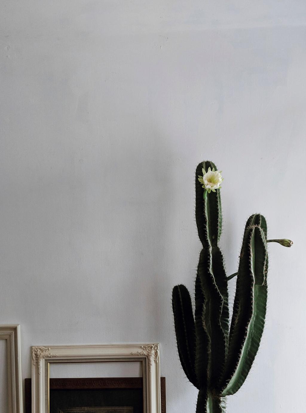
Building a 60–30–10 Minimalist Scheme

Choose Your 60: The Breathable Base

Pick a breathable base color for walls and ceilings that carries light without glare. Off-white with a warm, barely-there undertone is classic. Ensure it flatters skin tones and furnishings so the room feels kind, not clinical.

Layer Your 30: Gentle Structure

Your 30 percent adds structure: a deeper greige, sand, or soft mushroom on cabinetry, textiles, or a single wall. This creates form without chaos. Keep the temperature consistent with your base to maintain seamless transitions.

Design the 10: Intentional Accents

Reserve ten percent for accents that guide the eye—an ink cushion, a sage throw, a clay vase. Repeat this color two or three times, small and deliberate. Minimalism thrives on echoes, not scattershot surprises or competing statements.

Neutrals with Character, Not Noise

Layering Whites for Depth

Combine a warm white on walls, a slightly brighter white on trim, and a matte ceiling in the wall color scaled lighter. The micro-differences create soft depth, avoiding flat, chalky sameness while keeping the room serenely unified.

Greige, Mushroom, and the Space Between

Greige and mushroom bridge warm and cool families, making them ideal companions for wood, stone, and metal. They also welcome muted accents gracefully. Test samples beside flooring and fabric so their chameleon qualities work for you, not against you.

Charcoal and Ink as Grounding Elements

Deep charcoals and ink blues add gravity without overwhelming. Use on a console, frames, or a single low wall. Keep finishes matte to quiet reflections and maintain that restful, contemplative vibe minimalism is loved for worldwide.

Common Pitfalls and How to Avoid Them

All-white, all-gloss finishes can feel clinical. Introduce warmth through undertone, texture, and soft sheen. Matte and eggshell finishes absorb light gently. A single natural accent—linen, oak, or clay—can shift the space from hospital to haven instantly.

Common Pitfalls and How to Avoid Them

Small chips lie. Paint large swatches on foam board, move them around, and check under daytime and evening light. Metamerism makes colors change under different illumination. Testing saves money, time, and patience in a minimalist color journey.

Tools, Tests, and a Sustainable Workflow

Prime foam boards, paint two coats, label undertones, and observe for three days. Place boards behind furniture and near windows. This ritual slows impulses and turns selection into an intentional practice aligned with minimalist values and clarity.

Tools, Tests, and a Sustainable Workflow

Use palette generators, eyedropper tools, and LRV databases to pre-screen candidates. Build a restrained set of options before buying samples. Share your favorite apps in the comments so everyone can streamline their minimalist palette decision-making process.
Enigmaexperts
Privacy Overview

This website uses cookies so that we can provide you with the best user experience possible. Cookie information is stored in your browser and performs functions such as recognising you when you return to our website and helping our team to understand which sections of the website you find most interesting and useful.